Digimate

Branding

Digimate is a reusable buddy splint product designed to join two fingers together to promote healing. Created by an orthopedic surgeon, it’s designed to put comfort and function first. We developed this brand to be approachable, yet professional – a sure standout amongst the competition.
To kick off the nomenclature portion of the project, we set up a series of working sessions. Through Microsoft Teams meetings, we interviewed our client to understand his field and to discuss the engineering and intent of the product. Throughout that process, we generated a list of themes in which to categorize our bank of words. With guidance from our research, we assembled an array of names that were not only intentional, but also memorable.
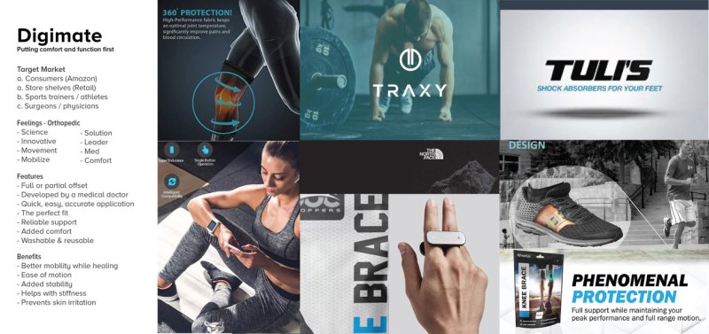
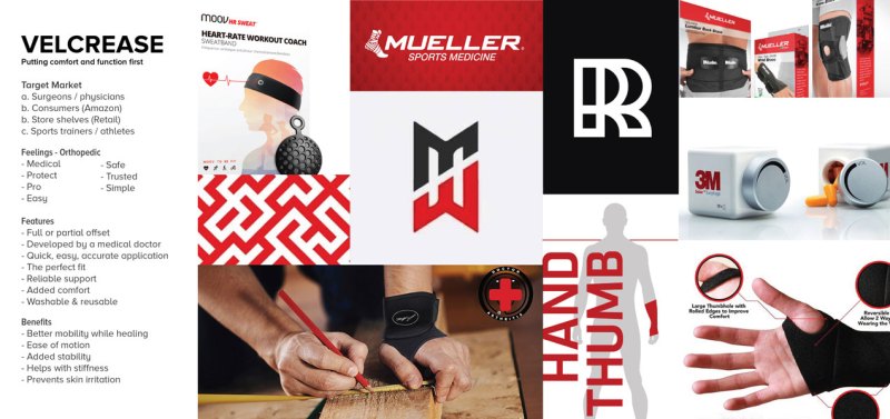
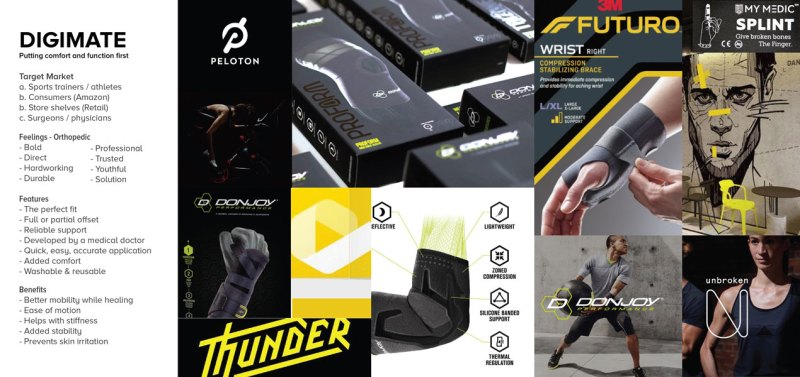
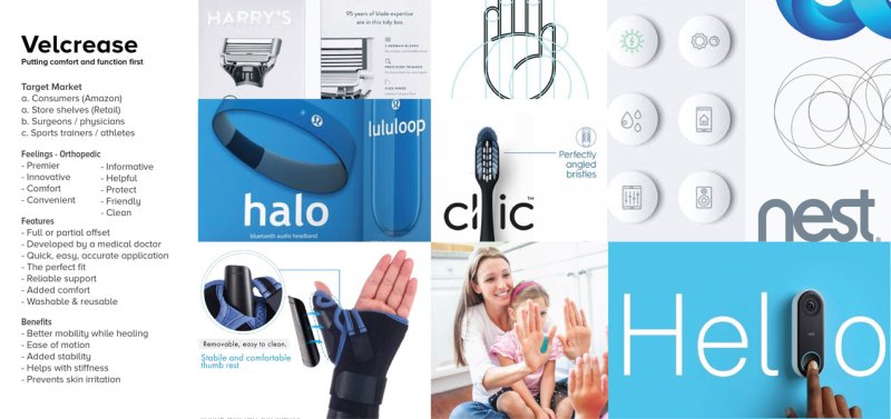
To visualize the full picture of the feel that the brand should go, we created four different mood boards with different colors themes, and overall brand representation.
We chose Mollen as the brand’s primary typeface, including some customizations to create the logo itself.
We explored multiple different logo variations before the final decision was made. Once we knew the logo, we did a color study to understand which colors best fit the desired brand experience and tone that we set with the mood board.
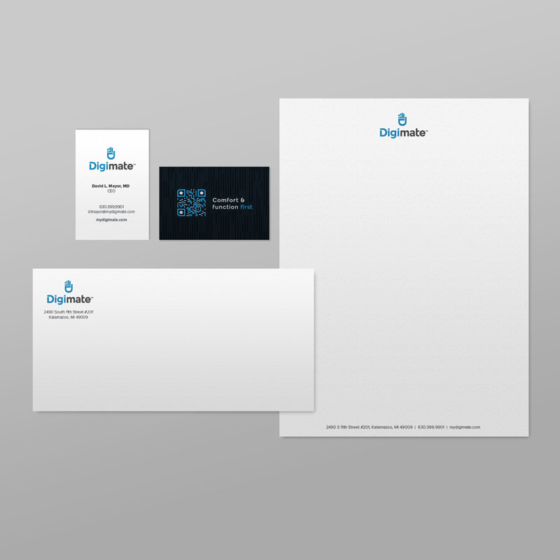
“Digi” represents the hand by calling out the fingers, or digits. “Mate” represents the joining of the injured and uninjured finger that creates a pair when the product is in use. Brought together, this name suggests the brand’s friendly and approachable tone. By turning the “D” in Digimate, you get the hand icon (shown here above the logo). This not only shows the product in use, but also represents the state of Michigan where the product was developed.
The tagline, “Comfort & function first” highlights the values and benefits of the product. These were the first two things Dr. Mayor addressed in his design, and are factors that other splints fail to accomplish. The Digimate splint is also the first product that Dr. Mayor has created and is emphasized by the word “first” in the mark’s tagline.